Master Paint-maker David Coles is creating a palette of colours that reflect the unique Australian light, writes Sabine Amoore Pinon of Still @ the centre in Byron Bay.
Early in the 90’s, David Coles moved from England to Australia bringing with him his passion for pigments, his expertise in art supplies and his youthful determination. What he could not know at the time though is that this red continent would offer him something most unexpected and surprising: a desire for new colours.
David’s first factory’s location – on Langridge Street – gave his company its name and, despite rather what he laughingly calls “bohemian” beginnings, hard work and excellence always flourished there. Manufacturing professional quality oil mediums, varnishes and grounds to supply artists with artist grade dry ground pigments and other quality raw materials kept David happy and busy for nearly two decades.
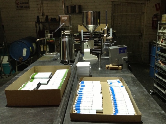
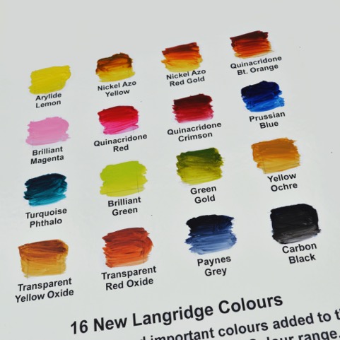
But being the invisible medium of the oil paint world was not his long term dream. Urged on by artists who told David they wanted a paint of the same quality as his mediums, Langridge’s Handmade Oil Colour finally came on the market in 2011. The company started its foray into paint modestly, with 32 on the initial production line, and eight extra added 18 months later. That was only three years ago, and last year they added 16 new colours, with the intention of having 80 colours on their final list.
This May, David is celebrating the first quarter of a century of his ‘young’ company – young in the colour world that is – with a delightful exhibition about pigments, colours and paint making, Chromatopia, opening at Tacit Contemporary Art space in Melbourne on May 31.
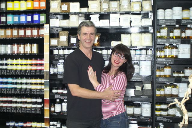
In a perfect match for a paint-maker, David’s partner Louise Blyton is an artist who runs an art store in Melbourne – full of all the Langridge products and the Golden acrylics David distributes here in Australia. Their enthusiasm for their projects and creations is infectious – and I’m increasingly intrigued, as they talk about their love of paint, about the title of Master Paint-maker. It certainly isn’t an honour bestowed on everyone. David tells me that the name reflects the dedication involved with the formulation of paint from scratch. “Being a Master Paint-maker as well as the founder of Langridge Artist Colours, I’ve grown very sure about following my philosophy of what paint should be. For me paint should not only have the highest pigment load possible to so that artists can get as much colour of the paint as possible, but it should also have a certain feel,” he says.
As he describes the quality of paint, it sounds almost like a chef describing a cooking method or food. “The paint is going to be reflective and honest about the way the pigment actually is and creates certain qualities. You have some colours that are naturally soft and quite fluid. Some which are quite buttery,” he explains. “Some are quite stiff, some clotted. It’s the pigments’ action upon the vehicle used creating that. You don’t see that with most of the other paints out there because they use some additives, mostly stabilizers, in quite large quantities which, in essence, homogenizes and evens out the natural qualities of each colour. I think that a pretty important part of an artist’s craft is understanding how paints operate slightly differently from colour to colour because they reflect what the pigment is actually all about.”
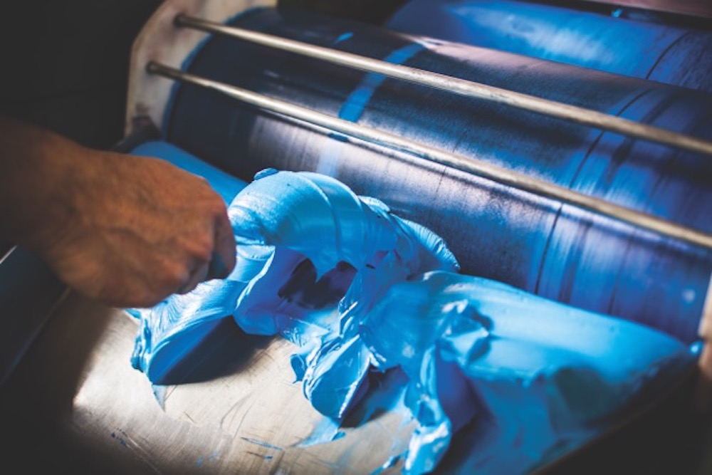
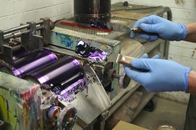
Despite the title however, it’s not exactly a degree you can go somewhere to obtain. This title is really learned on the job. “There’s nowhere you can go and learn to become a Master Paint-maker,” says David. “I learned a lot of my craft when I went to work for Roberson & Co. back in London in the 80’s, but in the end, I really learnt it on the mill. When you’ve got wads of colour coming at you from the triple roll mill, you start to learn. For example, with modern colours where you have to tease the colour, the pigments need to be separated from each other much more gently whereas the older inorganic pigments, like the Cadmiums and the Cobalts, are much easier to disperse – and something like Zinc White, which is a very soft pigment, needs hardly any work done to it to actually make it into a dispersed paint. And when we talk about dispersion, I’m talking about separation of the pigment particles evenly throughout the actual vehicle so that all the pigment particles are separated from each other and coated evenly in the minimum amount of oil possible to make it into a paste. Which is what we call paint!”
If there is a range of colours that are perhaps more difficult than others to work with, it’s the earth colours. “Some of my children are very obstinate,” David laughs. “The Umbers are very naughty. They’re thirsty pigments so they need a lot of oil. Our Siennas are naturally of a gritty consistency and that’s not because we’ve under-milled them but because that’s the nature of Sienna pigments. The Earth colours, because they’re naturals, have their own real individual qualities.”
I’m intrigued by the use of the word ‘our’, but as David explains he now has long term relationships with the major pigment manufacturers around the world. “I buy from the Germans, the British, the Americans, the Taiwanese, the Japanese, and we select pigments that are built to the specifications we need as artists. The most important factor is that they are not reactive with other painting elements, like solvents, that there is no solvability etc. and that they are highly lightfast. Also that, when they are dispersed, they have a working quality that makes a paint artists can work with,” he says. “There are now a lot of pigments available that are surface coated. For example, these days most Titanium White pigments have some kind of surface treatment which allows it to be dispersed in different types of vehicles for different applications. We’re offered a vast variety of them and so we have to be ultra careful about what we choose. It would be very easy for someone to be waylaid and pick the wrong pigment. You have to know a fair amount about chemistry. Not that I’m trained as a chemist, I trained as an artist. So my starting point is always – are these colours artists will want to use?”
Originally David had imagined that he would become an artist. “In fact,” he says, “I don’t think I had any doubts about that – actually I still am an artist. I have a studio, I still go in the studio although not as much as I used to, but my art informs very much what and how I make the things I do. Also my conversations with fellow artists don’t stop at selling them or supplying them with materials, it’s a constant ongoing conversation. All my friends are artists. I go to their studios, gallery openings, and over dinner at home we might start talking about their painting. I’m very open to helping artists because it feels, naturally, the right thing to do.”
His Australian career came about by accident when he first visited Australia on a holiday while he was working for an art retailer in the UK. “I became aware of what was available to Australian artists. Obviously there were a couple of Australian manufacturer’s brands here. Having worked for Roberson & Co. and in their venerable art materials store in London, Cornelissen & Son, I knew a lot about art materials and the benefits/negatives of each raw material that goes into a manufacturer’s formulations and products.”
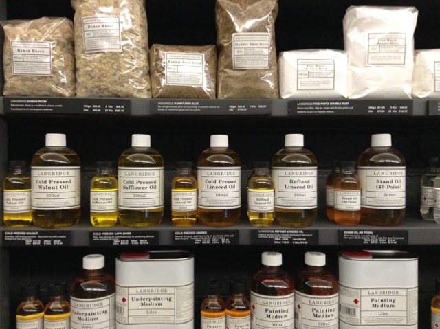
One of the biggest issues for David remains the use of linseed oil, which he uses as a binding oil for paint. “It’s magnificent,” he says, “but obviously it’s kept to an absolute minimum because used excessively, particularly in mediums, it promotes yellowing. The mediums that I could see here were basically, unfortunately, detrimental to the artists’ practice. So that’s why all of the Langridge’s fluid mediums are based on stand oil – polymerized linseed oil because it’s a non-yellowing oil. So I very quickly realised there was a gap in the market for a world-class medium for artists. Before I came back out here, I knew what I was going to do: set up an artists’ products manufacturing company in Australia. Even then I knew I wanted to make paint.”
David began his company by formulating mediums, rather than the more usual manner of creating paints for the simple reason that it was all he could afford to do at the time. “It took me seven years to be able to slowly find and buy all the machinery needed to start making paint,” he tells me. “The first mill I bought was a small mill. We still use it in the factory to make very small batches and often now trial batches. But it took me many years to be able to afford to get to that stage. So I started making oil paint mediums, which I formulated myself from scratch, again knowing what I wanted to get out of a medium for myself and what I knew was important for artists.”
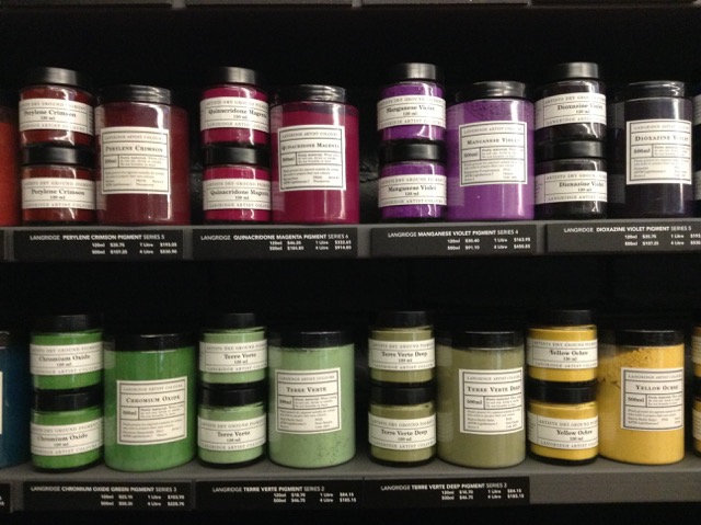
Listening to David describing paint and pigments is fascinating. “Of course,” he says, “pigment is pure colour. Some disappear and we introduce more colours but, as a general rule, we stock and sell about a hundred pigments here because some artists want to make their own paint and because they are so delicious in their nature as pure colour. In the paint something has already been denatured. It’s colour with a binder and depending on the binder, it can alter the optical vibrancy of the paint. Ultramarine is a classic. You can see the pigment vibrate but when mixed with oil it becomes very dark. You have to add white to it to start to see that light come back into it. I’ve always been in love with pigments anyway. I remember when I was around eleven and my mother had opened up an art shop in Henley where I grew up, and one Christmas she gave me a set of pigments, just little 30ml pigment jars and it was for nothing else except to be able to look at them. Like jewels.”
David has also always been interested in the history of art materials. “I’ll experiment by making something using a 14th or 15th century recipe… at the moment I’m making a traditional walnut ink made from their husks,” he says. “They’ve been fermenting in the pot for about two years now and the fermentation breaks down the sugars which creates a darker colour. I’ve also made a whole set of traditional lake colours from dyes. Things like Brazil wood and turning it into pigment and in the same vein I want to make some genuine madder but these are not commercial exercises this is purely out of curiosity and to understand I suppose how pigments used to be made and probably from that realise over again how incredibly lucky we are now. I’ve always been a big believer in this idea of science and art, technology and art actually, working hand in hand. I mean the history of technology is always written out of the history of art in regards to why artists started to paint in a particular way. Often it has to do with a technological breakthrough not an aesthetic or cultural breakthrough.”
What David is constantly striving for is a quality of paint that can compete with the best in the world. And that, in turn, feeds into his desire to create paints that reflect Australia. “Do I think there’s room in the world for another paint? There are already quite a lot of brands out there,” he says, rhetorically. “Where I think Langridge can make a difference is because of my interest in these modern highly chromatically intense colours. Creating a palette that reflects the Australian light in a way that light floods and energises the colours that it strikes and which comes from the dryness of the continent. There’s very little moisture, there’s very pure light and the scale of the skies are enormous. It doesn’t really afford the opportunity for much shadow. And when you do get shadows, the shadows vibrate as well. They become violet and vibrate that way.”
He is determined to offer an Australian palette in his range. “I suppose for example, that Zinc Blue attempts to fill the colour space that used to be filled by the old Manganese Blue which is a pigment that has not been in production for almost twenty years,” he says, “and that particular blue is very relevant to the Australian sky and Australian water, especially ocean water which has that kind of brightness and again that lack of moisture, or perceived lack of moisture to the eye because of the blueness of the sky as it strikes a liquid material! It’s the same with our Cold Brown Oxide. It’s a blend that replicates a colour very useful for artists, an old colour that was Cassel Earth or Van Dyke Brown. Those pigments unfortunately have strong problems with regards to drying rates, they’re very erratic. So, once again, I wanted to create another blend for this colour so useful to artists in particular for creating receding shadows, etc. without those drying problems. Of course as we go to the 80 colours, yes there is going to be more blends. And then I’ve got to be extremely careful about why I’m making them. That’s why I’m interested in what we call our brilliant range. We already had Brilliant Pink, which is almost like a hot bubble gum pink and have proceeded with a Brilliant Magenta and a Brilliant Green and we’ll continue to expand that range. The philosophy of that range is to offer the kind of vibrancy of a fluorescent pigment, but highly lightfast. So, again, these non-real or unrealistic colours are there because I know artists find them very useful.”
Talking with David it’s easy to feel that there was a sense of destiny to his arrival in Australia and to his career. “Langridge did have a sense of destiny unfolding,” he agrees, “a whole set of coincidences, accidental meetings, that led to me very easily settling here. And it’s interesting about you mentioning it being an old continent because Australia is of course the oldest continent with the oldest continuous civilisation in the world, and it’s something that I’ve thought long and hard about in regards to Langridge: what is our relationship with that part of Australian culture? I’m not working with a traditional aboriginal palette but we have a lot of aboriginal artists who buy our pigments and some of the very bright colours. At this point in time though, most of the indigenous artists I’m connected with work in acrylic paint not in oil. So there isn’t immediately some kind of connection to the actual materials. For the pigments we have a constant interaction and dialogue with communities West, up North and in the Centre. Our oil paint is not something they are particularly interested in at this moment. Acrylic is probably much more sympathetic to their painting style: waterborne, fast drying.”
Which brings us to the question of whether, in this age of fast-changing technologies, something as ancient as oil paint can survive. David is sure it can. “Oil paint is here for the future absolutely. I’ve made oil pastels, oils sticks, compressed chalks, charcoals, gouache, drawing inks, even shellac based ones…I do it more out of a personal interest, a curiosity. I would love to make commercially soft pastels but, again, there is so much to be done with oil paints I’m not quite sure I’ll ever find the time. Not just the oil colours themselves, I’m constantly inventing and formulating new mediums and new products when I see a gap in the market. A possible new tool for painters. I have just developed a more fluid medium, which has a more slippery quality than some of our existing ones, and a high impasto medium. We’ve been experimenting with some glass bead and we’ve just released a new encaustic wax… a modern formulation of a very traditional recipe. Encaustic, at this moment in time, is back in favour. We have a lot of artists interested in working as encaustic artists. All the materials available had to be brought in from overseas but I knew we could produce here a product as good, if not better, than those imported products. And again because I worked with encaustic 20 years ago, and on and off since that time, I do understand the working qualities and what this product needs to be, as a tool for artists. So far the feedback from encaustic artists with lots of experience themselves has been extremely positive. We do believe we’ve created something quite unique. Something we could even launch onto a world market and it fits, of course, beautifully into our pigment colours so in a sense it closes the loop all the way back to the very beginnings of Langridge. 1992 to now. A completion of the first circle really.”
Photographs: Sabine Amoore Pinon and David Coles
Sabine Amoore Pinon runs Still @ the centre, an art store in Byron Bay, and is a fan of great art materials. Check out her supplies here: https://the-centre.com.au She also writes a blog about her interviews with colour men and women all over the world. Follow her on inbedwithmonalisa.com
‘Chromatopia’ opens on May 31-June 18 at Tacit Contemporary Art Gallery – 312 Johnston St, Abbotsford Victoria.

